Take for example the film Saw, directed by James Wan. The titles are in a grunge font, white on a black background with heavy eerie music. There are screams, and flashing images flashing onto the screen. We do NOT want a title sequence similar to this type of genre.
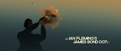
Another type of title sequence we do not want to imitate is one from an action genre movie. The James Bond series of films are notorious for having amazing title sequences, generally involving girls and guns. They are often computer generated or animated and use lots of special effects. The example I have here is from the 2006 movie 'Casino Royale', the theme of cards is present throughout the opening and this ties in with the rest of the film as the movie is centered around a game of poker. This type of title sequence would be totally unsuitable for our film.
http://www.youtube.com/watch?v=Nfc9GLxlhEw


A light-hearted title sequence such as a comedy, is very contrasting. The background is usually a solid colur, with happy-bold-text sliding in and out of the frame. An example of this would be the title shot in the trailer for the feel good comedy 'Little Miss Sunshine' which consists of a very bright yellow background and Bold words of the title, each word getting bigger till the word 'Sunshine' is the largest which makes it stand out to the viewer.

Another good example is the title shots in the trailer for the film 'Eternal Sunshine of the Spotless mind. Link to which is below:
http://www.youtube.com/watch?v=1GiLxkDK8sI
A romance however is usually composed of a white or black background with text in a colour that does not contrast and in an artistic font. A perfect example of this is the title shot from the trailer for the film 'Ps I Love You'. Link Below:
http://www.youtube.com/watch?v=3GNxdc-wlw4&feature=related


0 comments:
Post a Comment